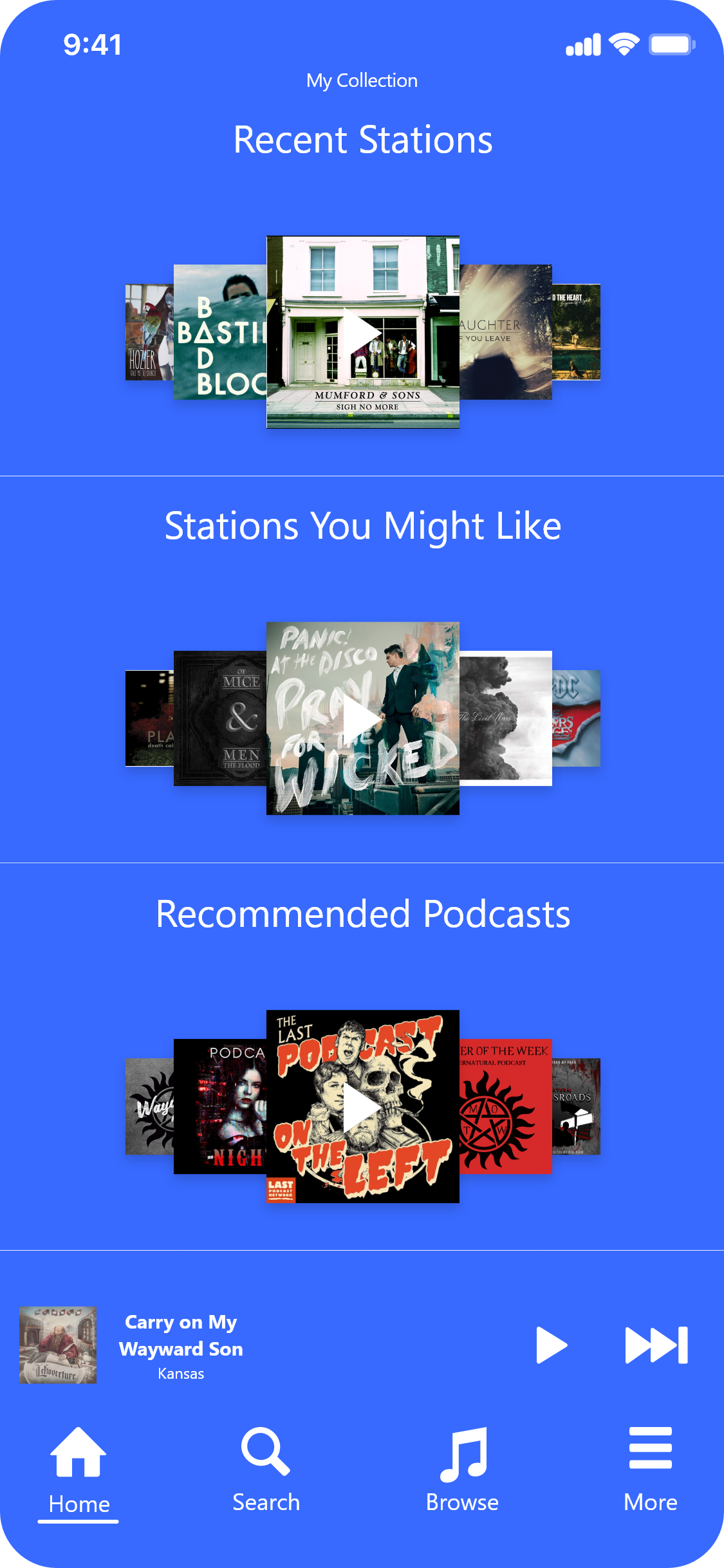
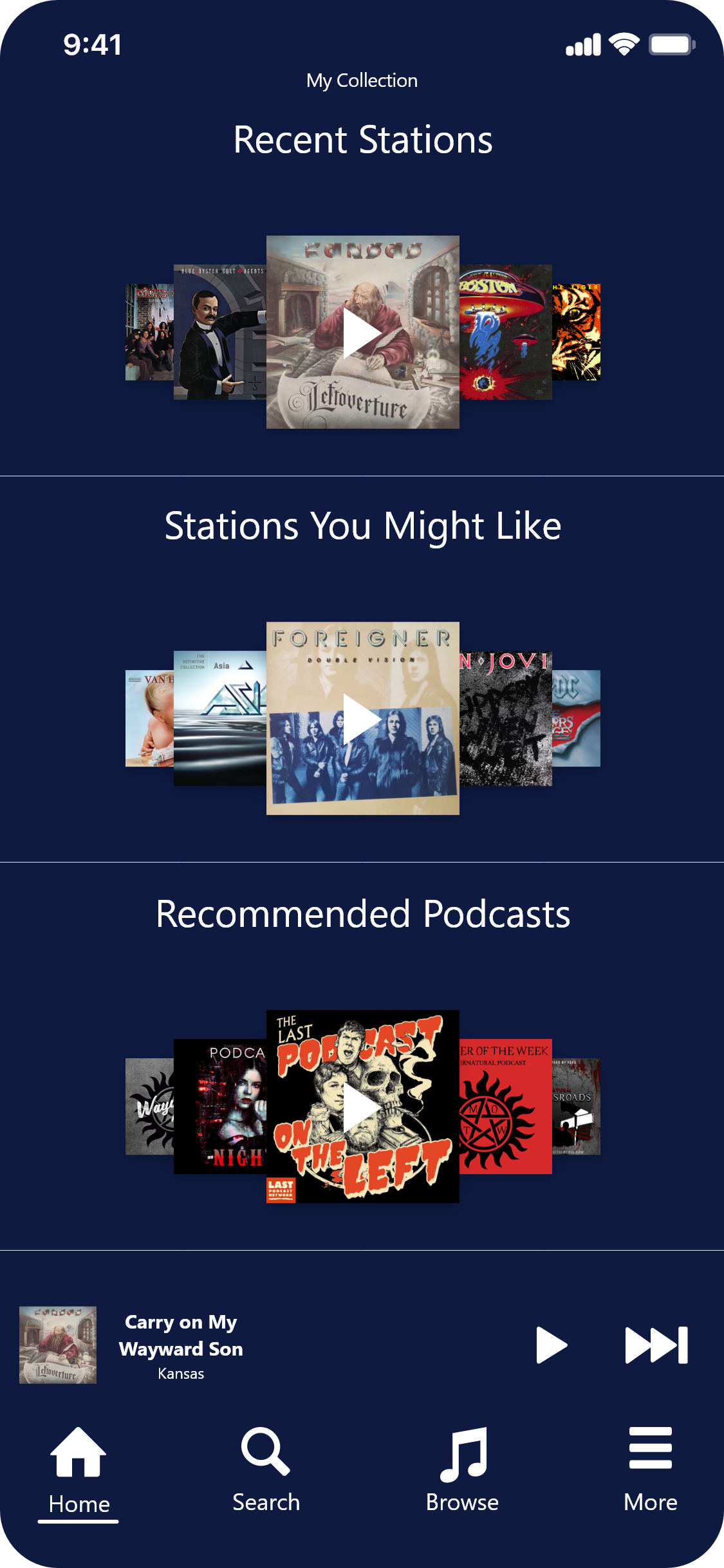
Pandora Home Screen Iteration
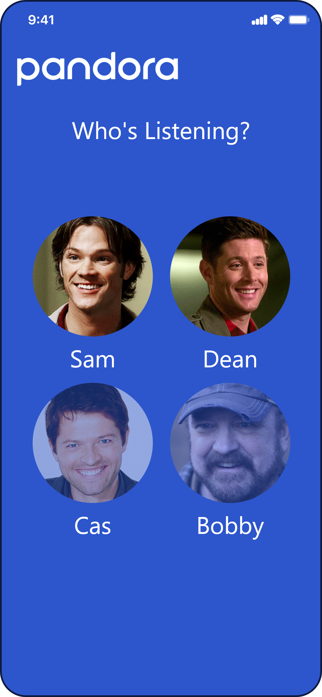
Pandora User Selection Dashboard
Pandora Home Screen Iteration 2

Pandora

HOME SCREEN REDESIGN

People utilize music for all sorts of different things in their lives. Listening to music should not induce panic to skip an inappropriate song for little ears or in professional environments. How could Pandora’s home screen experience be improved to take into account all types of listeners?
In a recent conversation with an educator friend of mine, I discovered that she loves using Pandora during transitions at her school. Kids seem to take to music and when the music is on the kids’ voices aren’t. On the weekend my friend likes to listen to various types of music that fall into the category of explicit. Sometimes she forgets that her last listened to station contained this music and has to scramble when she opens Pandora and it immediately begins playing. She also struggles to find playlists that are relevant to her students.
The solution to this problem was to research and design a new look for the home screen and add new features based on this information.

What I learned

The Pandora redesign project taught me a lot about generational misconceptions. In testing the product with people over the age of 70 I learned that a lot of aspects of the application are being taken for granted. For instance; profile, thumbprint radio, and lyrics are all hidden behind menus that users may not click. The app doesn’t give any feedback or info about how to use these features and the user is left to click around. Different generations have different preconceptions and ways that they enter into a partnership with an app. Elder generations might not feel as comfortable learning by clicking around while younger generations click to learn.